And is it available on a pc font list?
I'm writing a bunch of new curriculum and would be happy to change it to something simple, clear, and readable. My default font, comic sans, seems to irritate people (as was made evident by the comments on my recent blog.
You might appreciate Sylfaen. It's in the neighborhood of Times New Roman, but looks more elegant in larger quantities. If you are looking for a friendly MS sans serif, then Tahoma works. It is round, squat, and one of the easiest sans serif reads. Trebuchet MS is what you would get if a Tahoma had a Comic Sans as a great-grandparent. It's serious enough for road signs, but isn't going to be found in court. Futura is a sans serif masterpiece, but performs much better in print than on the screen. It would be perfect for a curriculum, IMHO. Unfortunately, you have to buy it, unless someone you knew in an online forum sent it to you.
I used Sylfaen in a game I made in the aesthetic of a story book and it's a great look. I second that one!
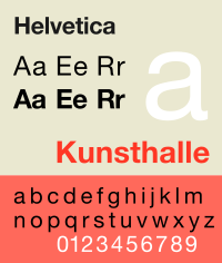
In my opinion, Helvetica is the best font for paper. It has energy and ink savings as well as simple characters and legibility. Garamond, however is widely regarded as the most legible font.
Errol Morris taught me that the greatest font, statistically, is Baskerville.
Actual data-driven typography. Pretty cool experiment. I wonder when the advertising industry will design the next hyper-believable font, Persuasion. I'm joking, of course, but it ought to be possible with experiments like these to suss out the characteristics of a font that engender any emotional response. /gets crackin'.
What a fantastic article. Baskerville has the gravitas necessary to be most convincing. and yet, in spite of its enormous disbelievability:We all know that we are influenced in many, many ways — many of which we remain blissfully unaware of. Could typefaces be one of them? Could the mere selection of a typeface influence us to believe one thing rather than another? Could typefaces work some unseen magic? Or malefaction?
omg, how can students believe anything I write if I present it to them in (blush) Comic Sans. “Dear @CERN,” wrote one science buff with a taste for typography. “Every time you use Comic Sans on a powerpoint, God kills Schrödinger’s cat. Please think of the cat.” Another groaned: “They used Comic Sans on the Higgs boson powerpoint presentation … Nope there is no hope for mankind.”
I think if you are going for "least fancy, clearest, and most readable" then Arial - Times New Roman - Courier (in order of fanciness) are going to be your winners. The basic fonts are boring, but they are extremely readable. They are not distracting. They are utilitarian which I believe they were designed to be.
Utilitarian is right. This guy was and is a designer for the fonts we use today. In the Ted talk I linked, he talks about desgning fonts being an engineering thing. It's pretty cool seeing the challenges that lead up to something we take for granted.
I was in love with Deja Vu Sans Mono for years. Nearly perfect for terminal and programming work, which is exactly what you'd expect from an open source typeface! Eventually I moved to a tiny-screened netbook and developed an appreciation for pixel fonts, most notably Dina, which I believe is the pinnacle of programming-centric pixel fonts. Tewi and Gohu are also nice. Limey is good for smaller sizes. At higher pixel densities I prefer Monaco now. For a while I kind of fetishized geometric fonts, notably Century Gothic, Eagle, and Gotham, and slab serifs like Rockwell, but in practice they aren't so great. Georgia was fine for lower density pixel displays but Sentinel and Mercury are nicer with a bit more density. For posters and signs I like to emulate Italian and Spanish artdeco lettering circa 1930s. Now I pretty much just use stock Droid fonts as my main device is a tablet.
For monospace fonts I use Anonymous Pro: http://www.marksimonson.com/fonts/view/anonymous-pro but this is probably not good for a blog :) I don't mind comic sans, in fact I've heard some speculation that it helps people with dyslexia.


