Airline maps are geographically accurate because air travel is deeply disempowering. They have been less and less abstract since the '70s because the deregulation of the airline industry has had the effect of making airline travelers less and less like luxury adventurers and more and more like breathing cargo. "You are here" is a valuable thing to know when you're disoriented, when you're feeling oppressed, when you have no handle on the situation and no power over anyone. We now live in a society where a stewardess can have air marshals arrest you for giving them lip - air travel is plenty Kafka-esque without turning the only orienting document available into a circuit diagram. Beautiful work, though. It absolutely belongs in advertising, where your audience is safely oriented in their own locale surrounded by possessions they have in their control. Turning the world into a system ready for the client to utilize is exactly the mental space you want to put them in. Then once they get in the plane, give them a moving map display. "Folks, if you look to your left you'll see Mt. Hood" does not happen because the flight crew is bored. It happens because a disturbing percentage of passengers are looking for an indicator they aren't on the wrong plane.
Air NZ have a "channel" on their in-flight entertainment called "Flight Show" - it gives a graphic of the aircraft's current position on its trajectory, nearby cities (if any), airspeed, temperature outside, time-to-arrival, tons of stuff. I like it a lot."You are here" is a valuable thing to know when you're disoriented
If I understand you correctly, the journey matters less and less (from adventure to sleeping pill), so it's not important where you are? It's probably the reason why most airlines don't have maps anymore, or hide them somewhere deep on their site. Have you ever had the joy of flying with Ryanair? They can get you from small airport to small airport really cheaply (30 euro is no exception) but they try to screw you over at every turn. There's a reason more than half of their Wiki page is under Criticism. I've never looked more at a little plane icon on a map more than when I flew back from Hong Kong. My plane had those in-flight entertainment brick-iPad devices, where you can track down to the minute how long you still have to sit and down to the mile where you are. Even though you're going so fast, everything looks slow if you still need to wait 6 hours. The map is very much for picking out where to go - when I want to go on a trip, anything is an option. It's the equivalent of throwing a dart at a world map, but you also know how to get there.
Not exactly. The sense of empowerment has been so completely diminished that any totem that gives you a feeling of control rises in importance. A diagram tells you what to do - a map tells you where you are. If you are feeling active, a diagram is great. If you are feeling lost, you need a map. Modern air travel is all about making you feel lost. Even that barely-moving-map display counts for a lot. That's why they give it to you.If I understand you correctly, the journey matters less and less (from adventure to sleeping pill), so it's not important where you are?
A natural companion to the point you're making here might be ribbonfarm's explication of the future nauseous. Indeed, air travel is cited as a prime example of the future nauseous, where—in spite of the fundamental alien weirdness of hurtling through the atmosphere at 600 mph—airlines cloak the experience in "a manufactured normalcy field" by doing things like controlling climb rates, setting bank angles, and prescribing acceleration profiles. The sum of these controls is to take what's essentially un-human and un-cognizable and render it familiar and digestible. How do maps fit in? I'm not sure, but if the theory of the future nauseous holds water, then my hunch is that the airline maps derive their particular look and format from the necessity of maintaining the manufactured normalcy field.
Ryanair and Wizzair are soo sneaky! They charge you for every little extra, try to trick you into buying "insurance" and do everything possible so that you don't print your ticket and pay the "check in charge" at the airport. But I guess that's how they keep the prices so low so gotta deal with that...
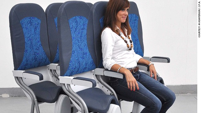
Some things Ryanair tried, fortunately unsuccessfully: - introduce paid toilets on planes - get fat people to pay more. Not the ones who need two chairs, nono, those already pay double. No, the person who's "just" fat but still fits in one chair, let him pay too - have planes without windows - have planes with "vertical seats", basically leaning against a tilted wall just so more people fit in there - replace the copilot with a steward: "copilot is only necessary when there's an accident, so why can't the copilot replace one steward?"


