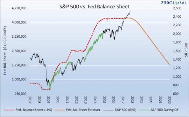
Just to add, because this graph has been much on my mind of late: The wiggly black line is the S&P500. The wiggly green line is the S&P500 on drugs ("quantitative easing" or "the government buys up a bunch of shit so there's money out there"). The dotted orange line tracks how much shit the government has bought up so far; the solid orange line tracks what the Fed has declared they intend to do with all the shit they've bought (dump it like it's on fucking fire). There's two ways of looking at this, too: on the one hand, the S&P is climbing without the government buying it so clearly, the experiment worked. On the other hand, the government hasn't dumped anything since 2008 and when they did, things went really badly so maybe this isn't a great idea hey?
