I love everything about this.
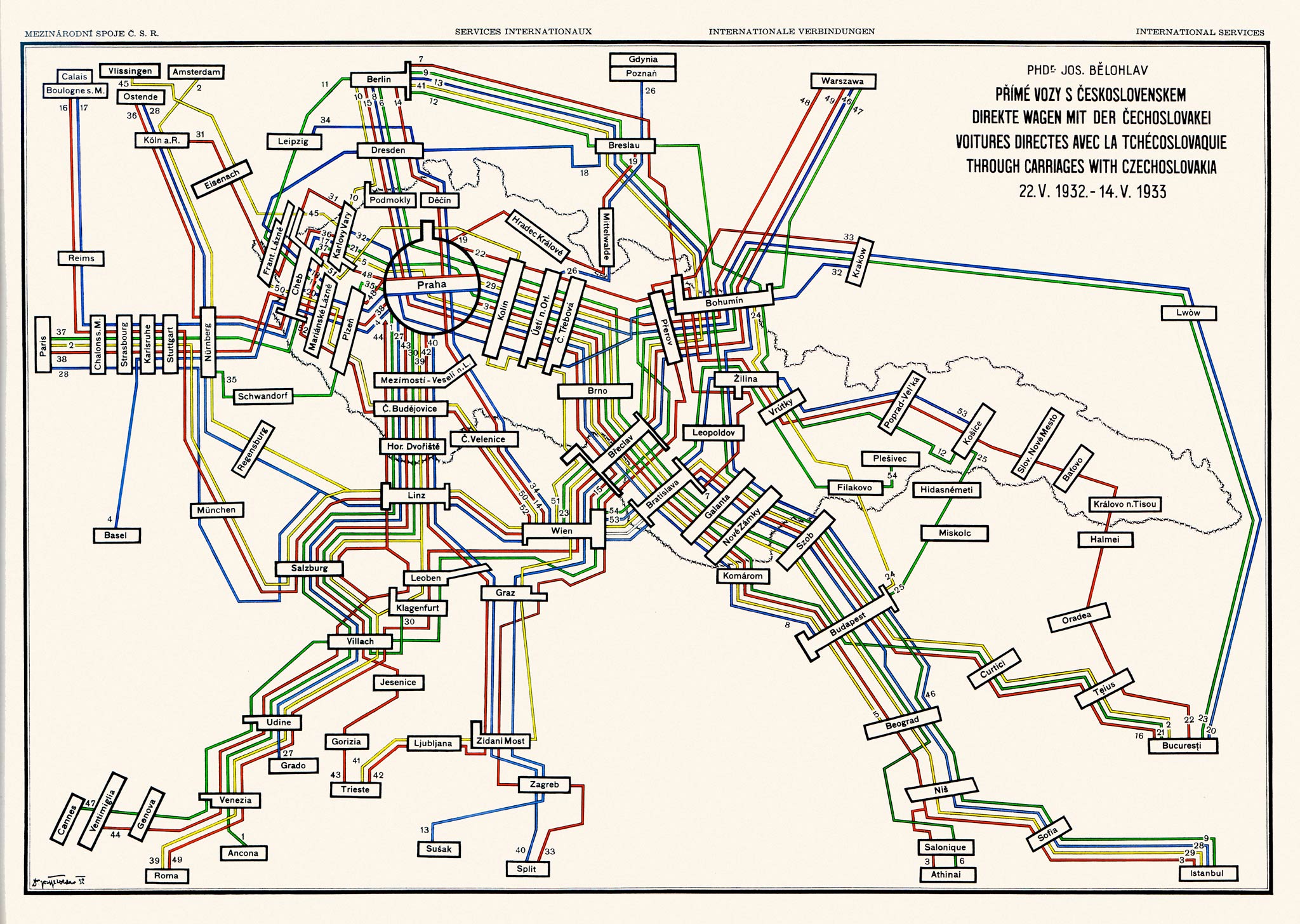
...see, and that's the sort of cartography that made me flay a Thomas Guide all over my walls and connect the Metro stops with colored yarn. No part of that conveys information in an easy-to-read way. It's worshipful of the network but dismissive of the users.
Much like rail in general.
It's interesting to compare rail coverage maps with airline coverage maps.
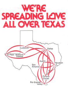
Rail maps are all about straight lines and orderly bends and inflicting their geometry on the world (which is usually completely absent from the imagery). Air maps use great circles even where they make absolutely no goddamn sense - "we're above all that" but because you necessarily have to travel from the endpoint once you get there, air maps are very much a part of the existing cartography. "We'll land here which is close to where you need to be!" as opposed to "here's a stop. It is an indeterminate distance from other stops. What's around that stop is completely irrelevant because the only thing that matters is where our lines stop."
Rail, in the US at least, refuses to be a part of multimodal transportation. Bus terminals are rarely where rail terminals are and I once spent an hour and a half on two bus lines trying to get from the airport to the Amtrak station in Portland. If you're on the train, if you're on the subway, if you're on the Metro that's all you're doing. You're going from station to station and that's it.

Even when it's completely illogical to show things to scale, the airlines try and show things to scale. You might be above the world, but you're still connected to it.
posted 2316 days ago