Where are you on Klimt? Perhaps more importantly, where are you on Klimt as he relates to Mucha? Finally,where are you on Giacometti? Consider these diagnostic questions.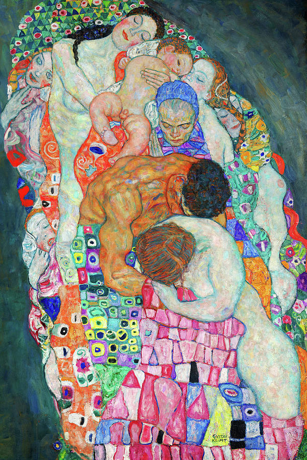
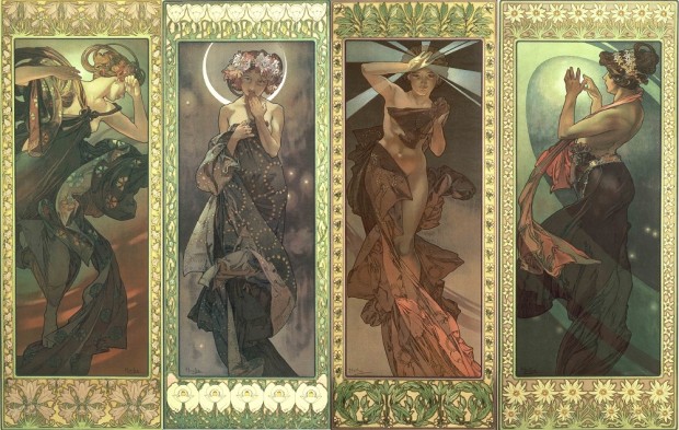
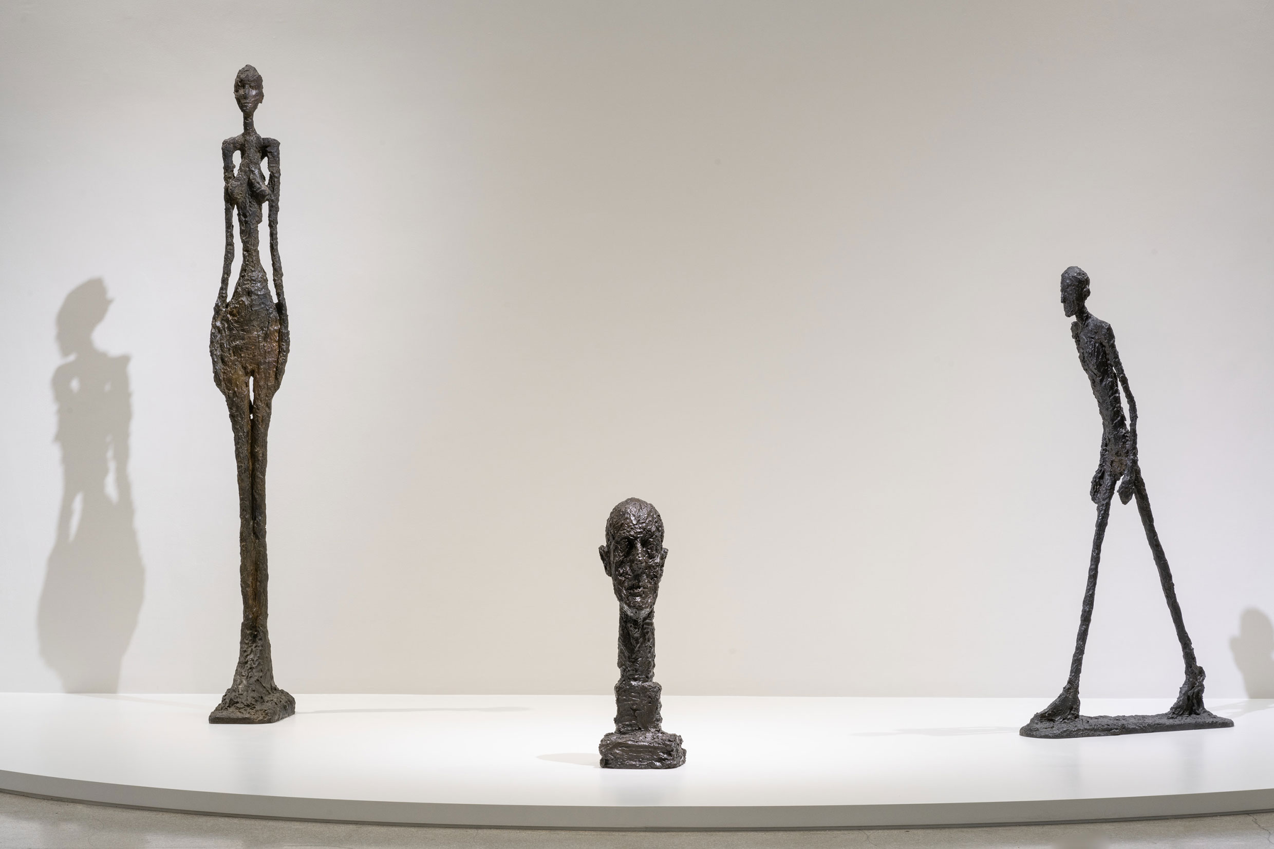
I see Klimt as largely decorative. It doesn't stir much of anything in me. He's one of those artists where style is so pronounced, that I don't see much more than variations on a theme. Mucha is interesting in that I have been thinking a bit about how post-impressionist works often look like illustrations. Like they've been made for print. Which in Mucha's case, often were. That's where design starts to take a leading role. So much has happened around visual design since these pieces were created, and so much of it was commercial. It's difficult for me not to see them through that lens. As a result, Klimt's works feel a bit more organic, a bit less illustrative, and maybe just a bit more interesting to me than Mucha's. But Mucha's look very nice. I'd be more apt to hang a Mucha. Giacometti's sculptures are the most evocative of the three to me. They definitely have a design aspect, but I think they also inherited much of that since creation. For some reason, they feel a bit more sincere to me than Klimt. They exist in 3D as figures, so they are both representations and actuality, and IMO there's where the success lies. They kind of balance between looking like something, and being something.
To me, this says that it's the composition that disturbs you. Many people have pointed out that Klimt was threatened by women which is why their hands always look like claws. He also clumps his humans in with abstract color, but it's "human" "abstract color". He follows the rule of thirds, his compositions are balanced. Mucha used color and ornament to great effect (combined with photorealistic faces) and your response is "commercial." Which, yes, they were. Although I'd be curious as to how you regard the Slav Epic: Regardless, it's clearly not Chagall's use of color that disturbs you. Your reaction to Giacometti cements my thinking. Giacometti is all about framing in that he eliminates all but the human form, warped. You can't help but regard his art as a play on framing as you must regard it in relation to yourself. Chagall frames in a deliberately random-looking way. You find it disquieting because he's aware of the rules and distorting them for effect. You find that effect displeasing because framing is an important part of your artistic style... in the direction opposite Chagall.
I think that's close to the mark. Yes, I'm not much bothered by Chagall's use of color. I don't love his palette, but I do find his non-traditional composition to be icky. It creates a reaction. The Slav Epic looks amazing. It's probably pretty clear from my own paintings that I am not much into unbalancing the viewer, at least in terms of composition. I definitely wouldn't accuse Chagall of having a schtick. It's clearly coming from aptitude and experience. The schtick/style/voice space is one that is interesting to me. It's also interesting to me that there merit in being original, and being genuine, or at least in the ability to create controversy around it. I know that plenty of artists explored that space. I guess proof to your point, is that I'd much rather hang a Kinkade than a Chagall.